Our visual language reflects our values and our mission. Simple, yet full of meaning. Understanding how to use our logo is key to that visual language. Here are tips for when you’re representing our brand.
LOGO USE
Main Logo
This is the main logo of First Presbyterian. The horizontal lockup is the primary option and appears on our stationery and website. You can use the black and white version for print if need be.
Icon Logo
This logo is used when the name "First Presbyterian" is not needed. So me good uses of the icon logo would be business cards, t shirts, photos and for a social media icon.
Download
Logo
LOGO SIZING AND SPACING
Logo Sizing
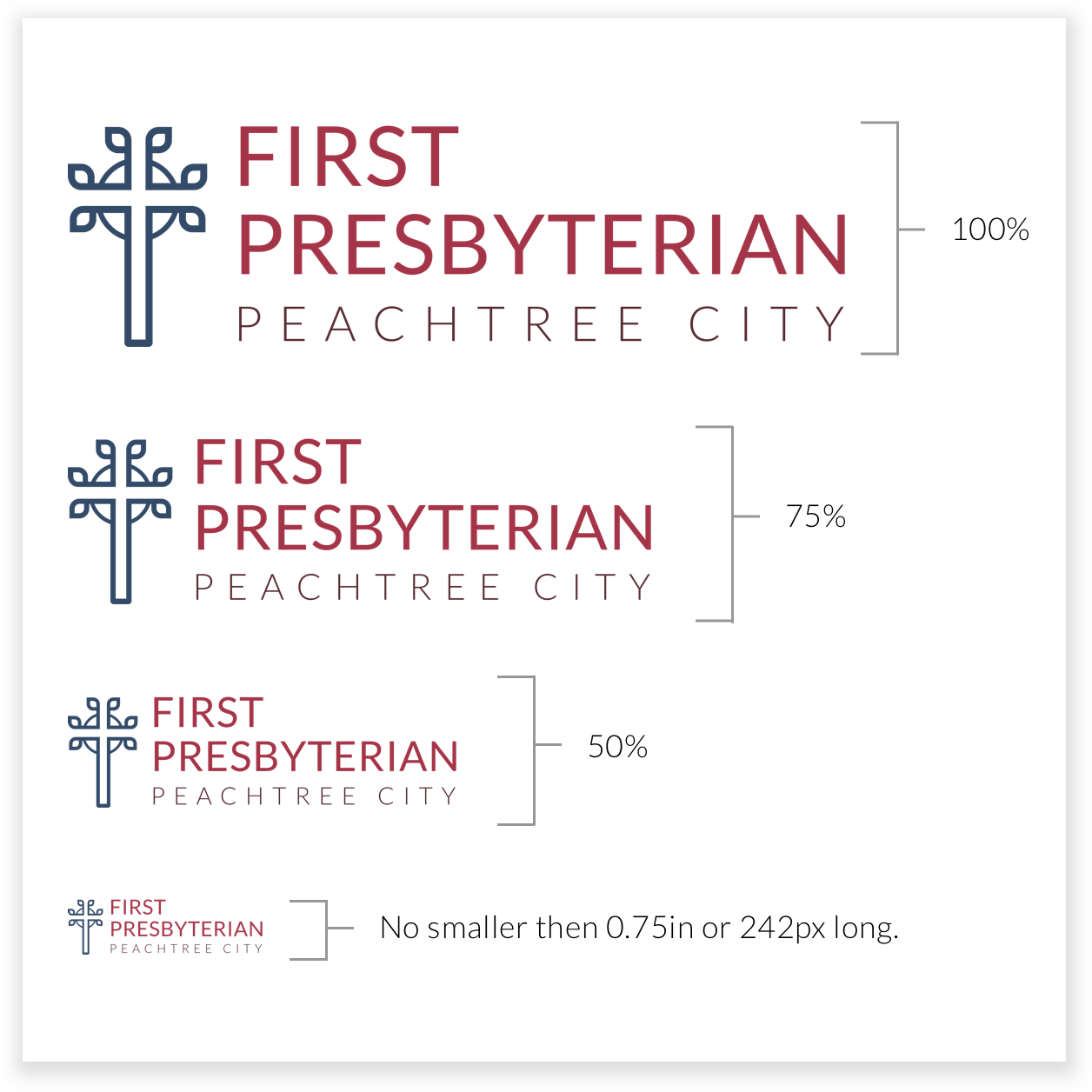
The small execution logo should be used to optimize legibility of the logotype on desktop, mobile and print applications. The minimum logo size can not go below 0.75in or 242px long. These are our benchmark sizes, but variance may be used for specific circumstances or constraints.
Spacing
There should always be ample space around the logo to ensure maximum impact and keep the mark from looking cluttered. At least a 70px spacing around the logo is required.
HOW NOT TO USE THE LOGO
Stretch or Pull Logo
When resizing the logo make sure to resize all sides evenly.
Shrink or Squeeze Logo
When resizing the logo make sure to resize all sides evenly.
Rotating Logo
Logo should stay at a horizontal position, although there are times that this will be allowed.
Blurry or Pixelated Logo
If your trying to blow up a logo but it looks blurry the best think to do is use a larger logo size or a .EPS file. The logo must be clear and clean at all times.
Logo Color Change
The Logo must not be any other color then what the brand colors are.
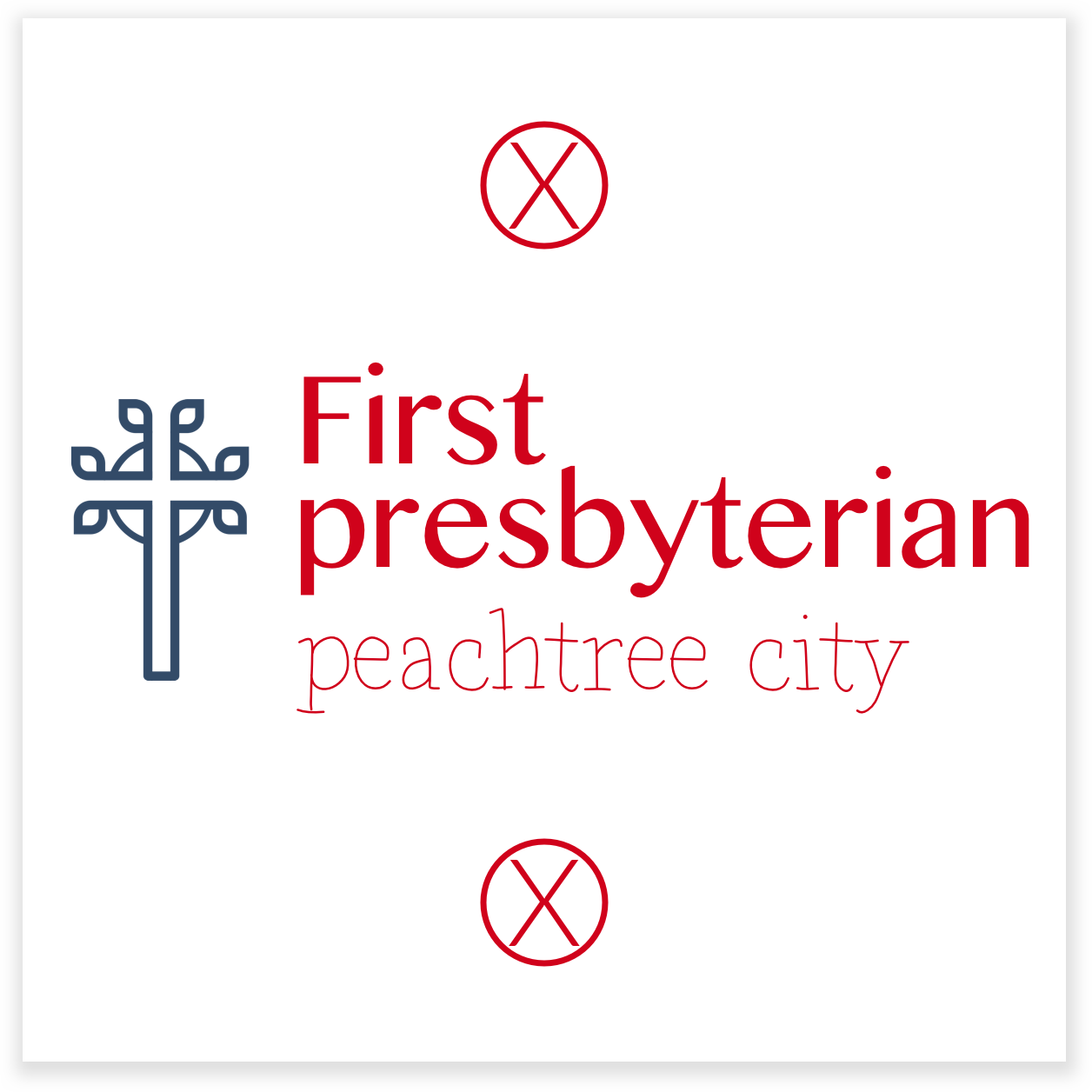
Logo Font
There can be co color or font change to the logo. Even if you find a really cool font that you like!


